Twist Clinic
Lisboa, Portugal
Client
Dr. César Pimentel
Status
Built
Project date
2019
Construction date
2019
Construction area
276m2
Photography
Awards
Winner of the Prémios Lusófonos Architecture and Interior Design Award - Interior and Exterior Design: Hospitals and Healthcare category
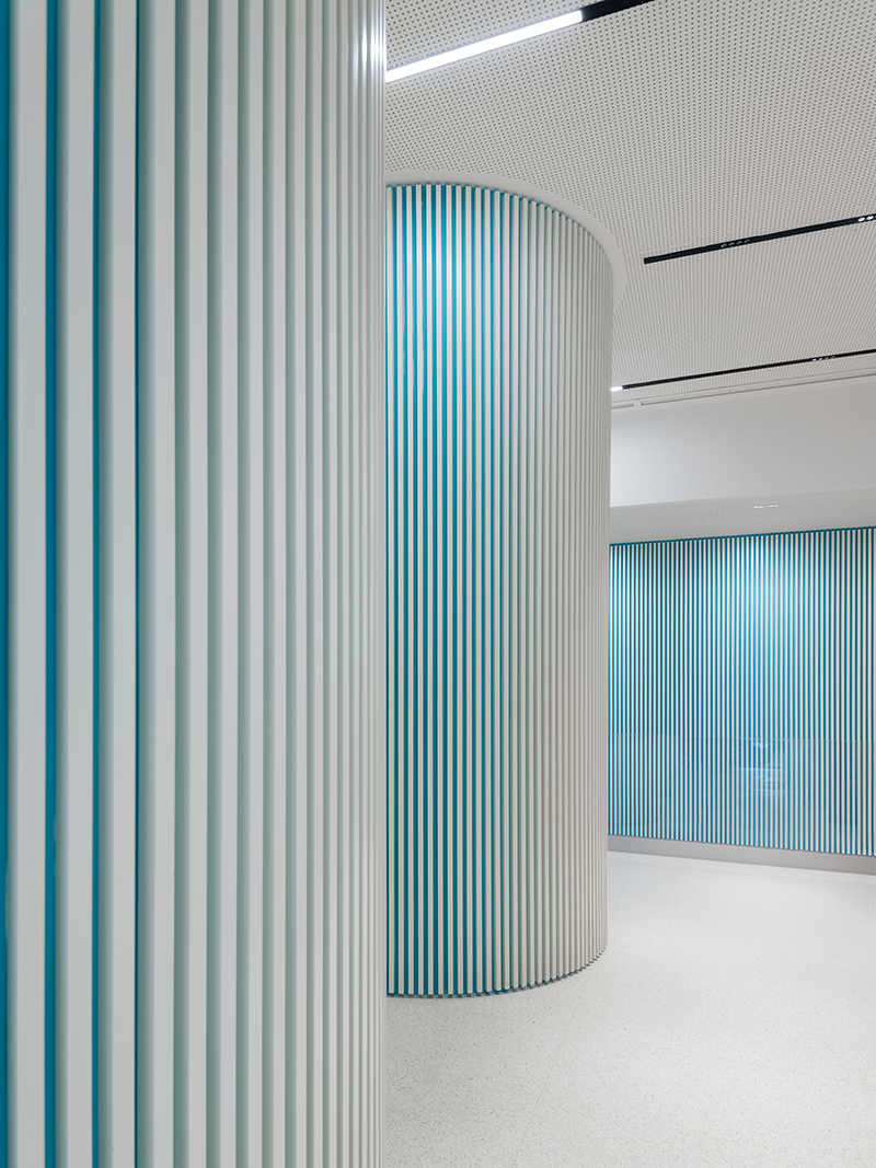
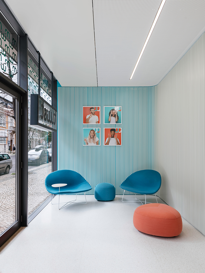
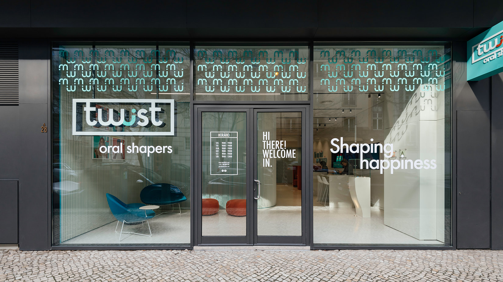
Spanning 276m2 Twist Dental Clinic has made a significant impression as the first oral care clinic in Portugal exclusively dedicated to Invisalign orthodontics. The dental specialist uses advanced 3D-imaging to develop unique transparent aligners tailored to individual patients, easy to place and remove. Located in the heart of Lisbon, its pioneering service offers a fresh approach to dentistry geared towards a public ‘walk-in’ concept, utilising digital tools with brief, usually non-invasive consultations.
Being a new and unique concept, this clinic required a bold and progressive design which would encourage public flow and informal entry. While our mission was to capture the attention of passers-by, by enhancing the transparency of the façade and exposing more of the interior, we also delivered an intuitive design to maximise space and carefully cater for technical areas.
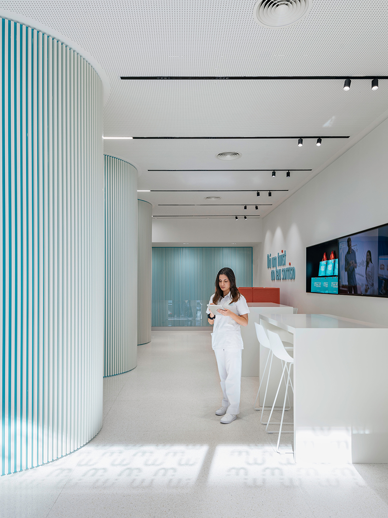
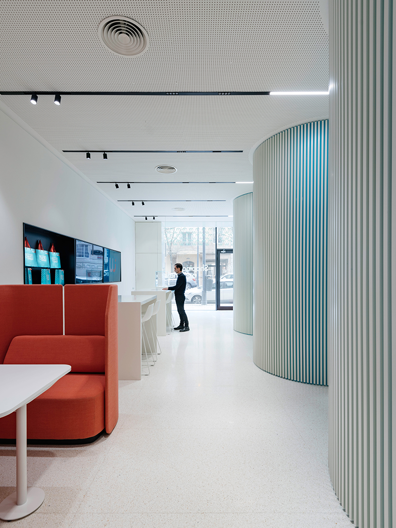
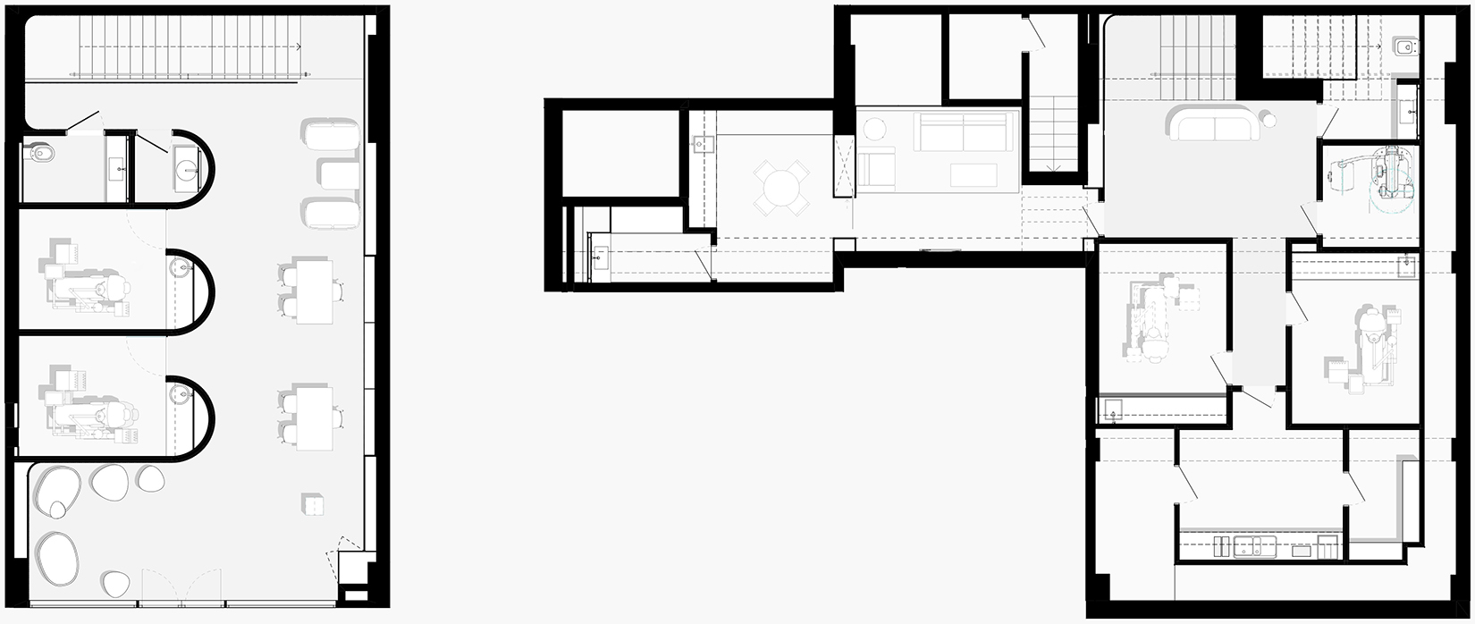
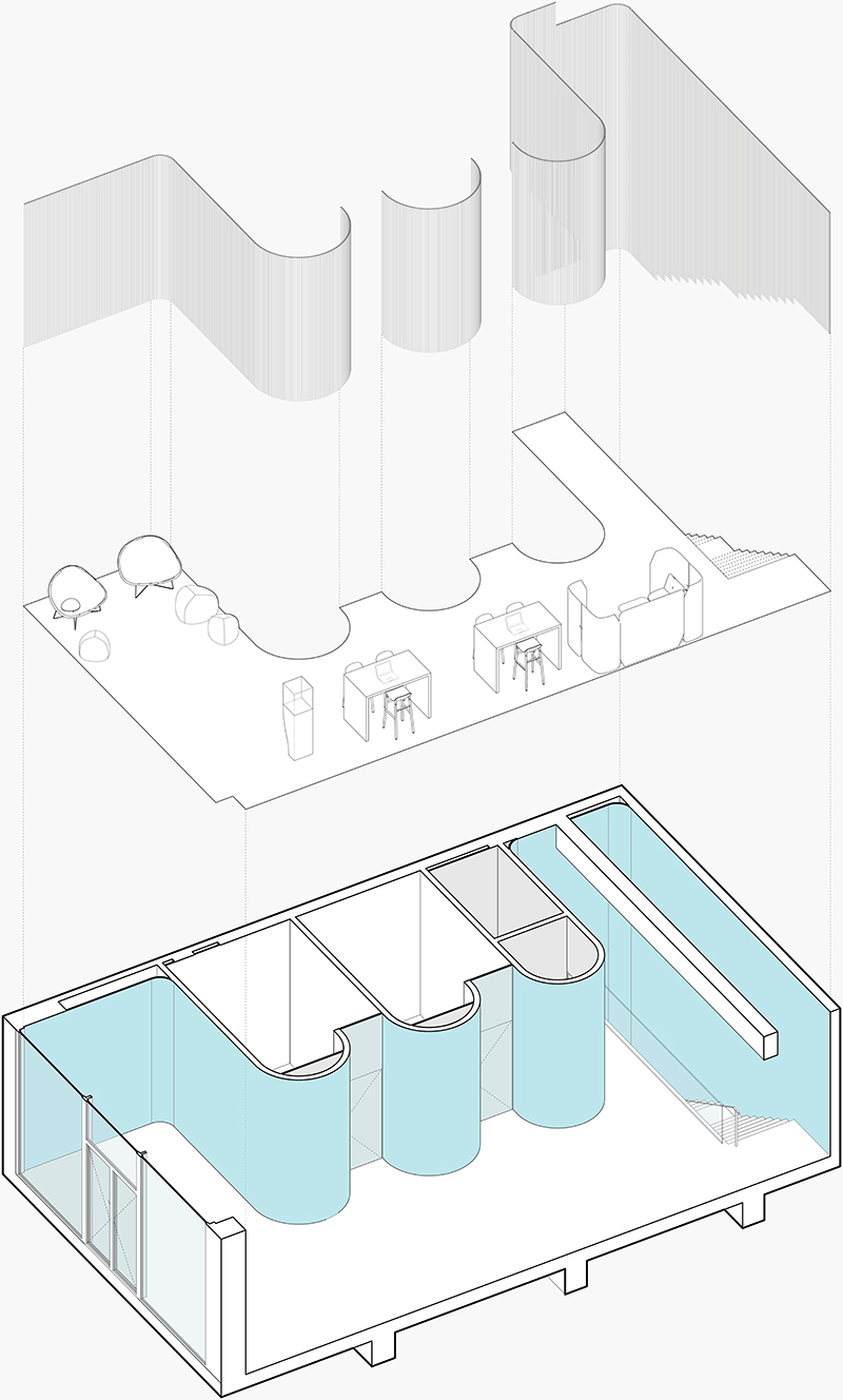
The wider design layout is strongly influenced by the type of treatment taking place at the clinic and the idea of brief consultations, which is distinct from conventional dental clinics.
The space is geared towards more informal conversations with no defined reception desk distracting from activity on the ground floor. Instead, we developed several scattered service points, marked by different types of furniture corresponding to distinct services.
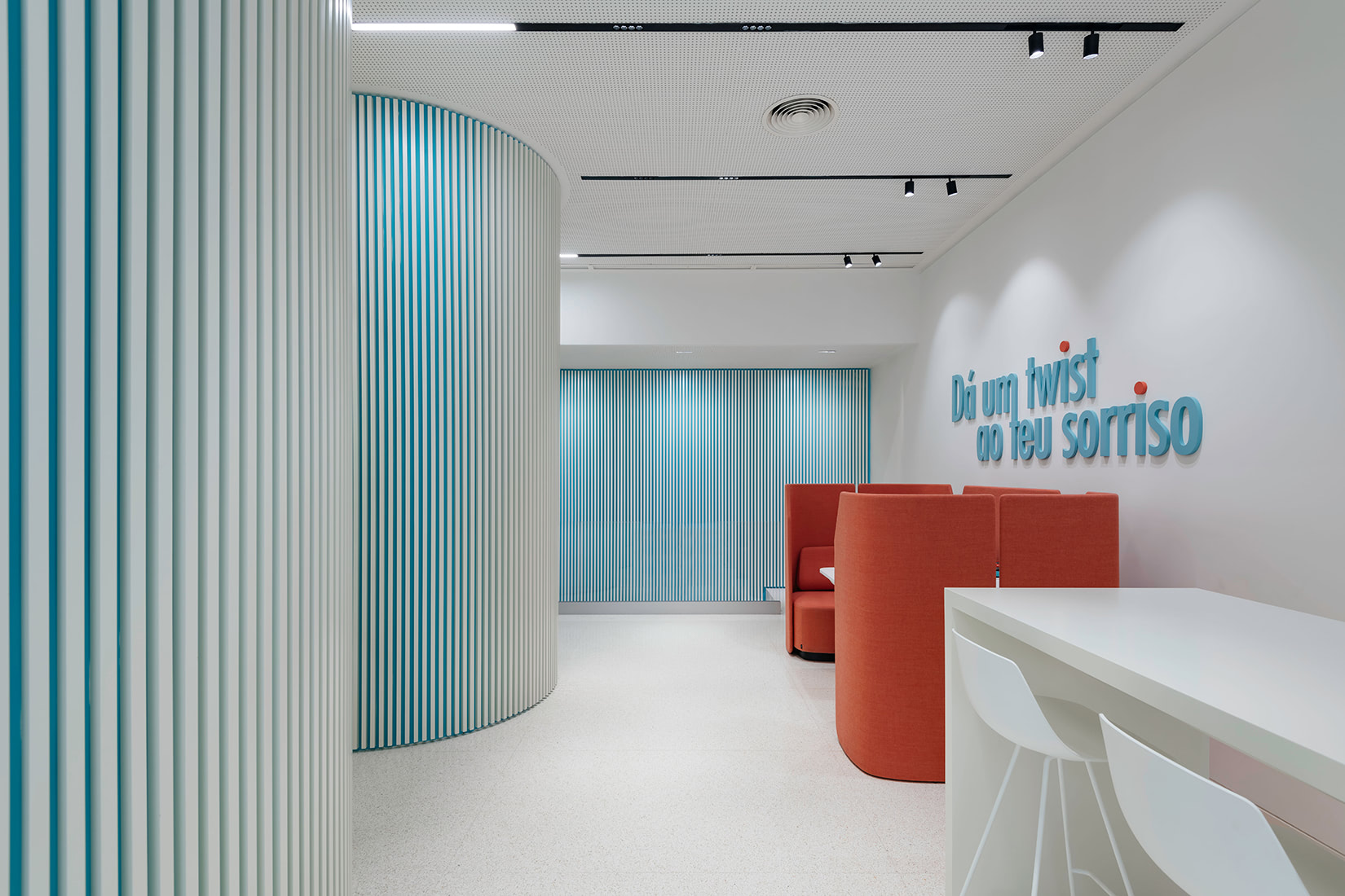
These spaces have been sensitively designed with varying levels of privacy, for example high tables for immediate appointments and acoustic furniture for meetings with patients who need more privacy along with offices for treatments and consultations.
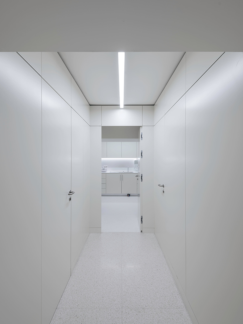
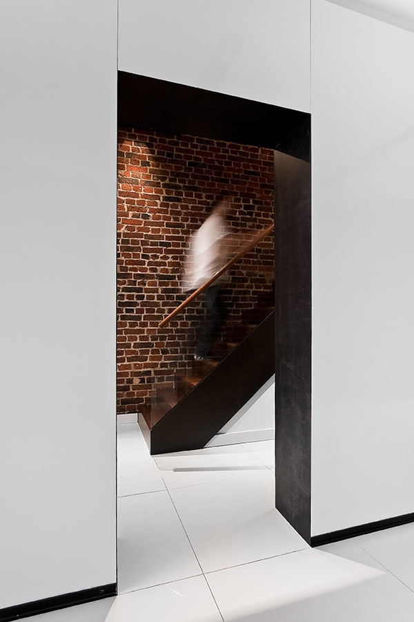
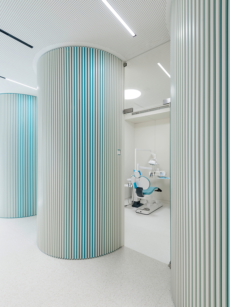
The main service centre, located on the ground floor, is influenced by the shape of the jaw and aligners with reference to the clinic's key form of treatment. This includes offices, the brush program bar and sanitary facilities, which grow organically to optimise the space. The rest of the clinic, on the subterranean level, is devoted to technical space including x-ray and sterilization rooms with additional offices and storage rooms.
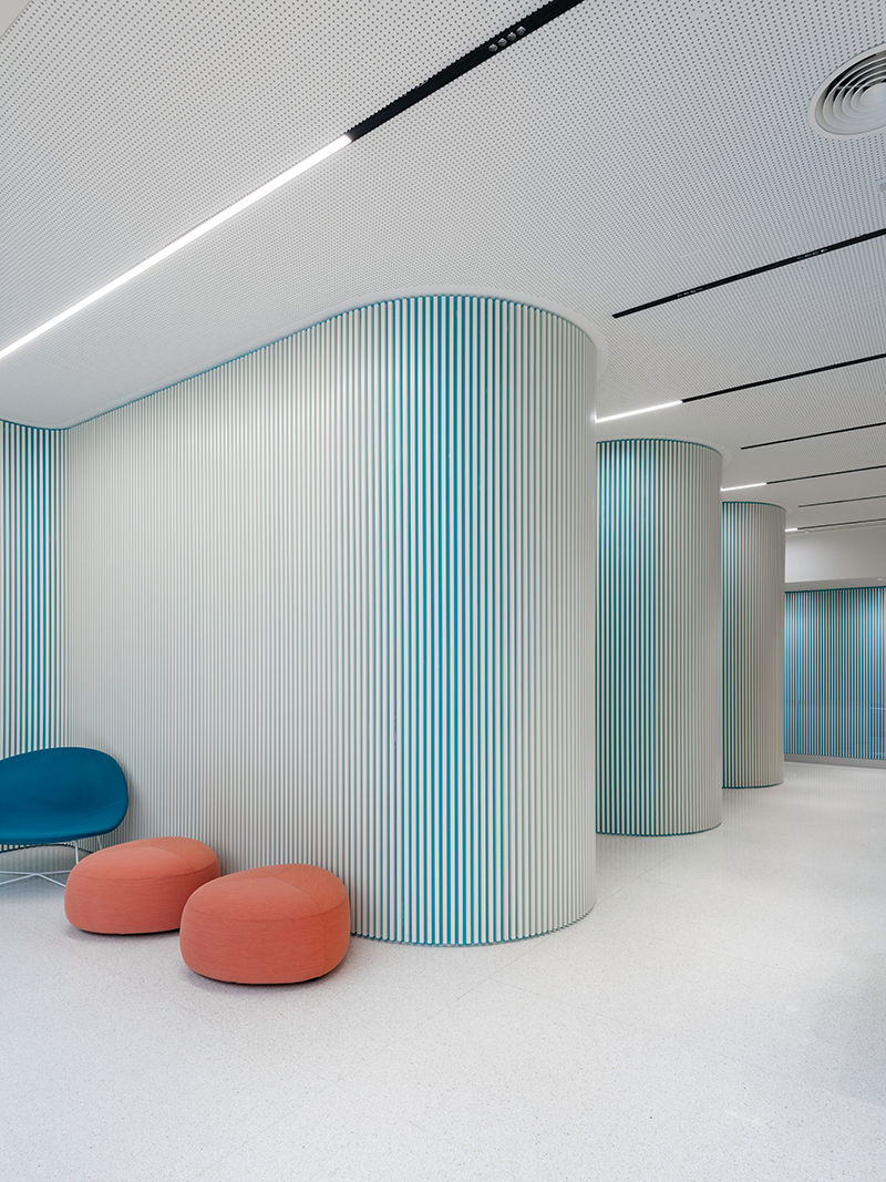
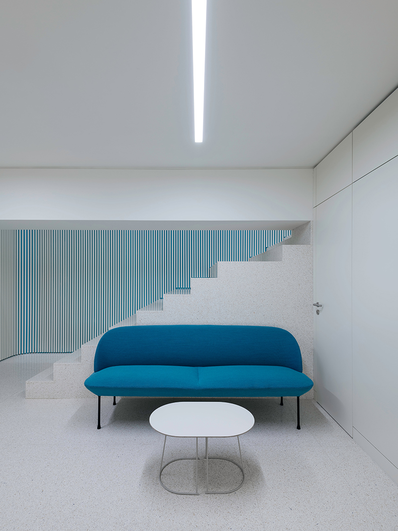
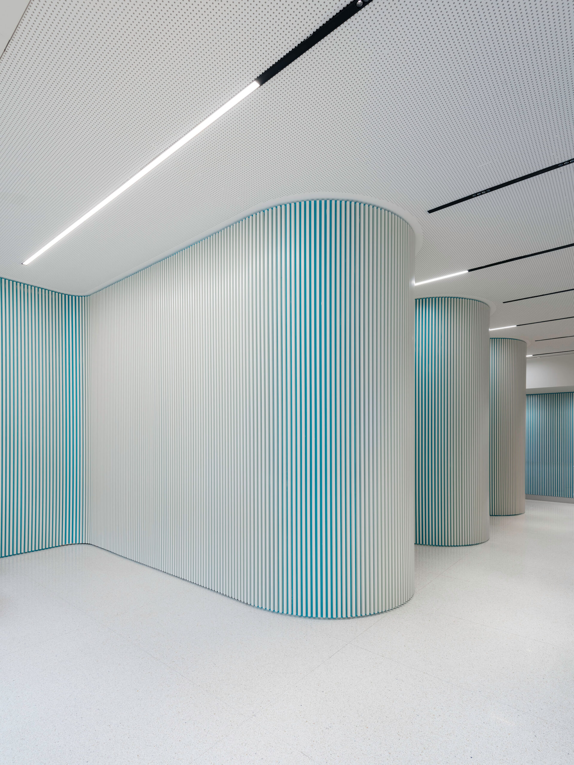
The selection of strong, bright, hard-edged materials including composite marble with slight pigmentations and largely white walls and ceilings creates a clean and clinical edge. A fundamental element of the design involves a vibrant blue tone applied to the main walls framed by vertical white slats. The intensity of the block blue colour is balanced by the refined white line slats which sit discreetly above. Due to their dimensions, they can be distributed over a large surface area, providing design continuity across the entire interior.
In combination with bursts of watermelon red in specific elements of graphics and furniture, this concept allowed us to subtly introduce the clinic's brand colours, injecting unique style and personality associated with freshness and a young language.
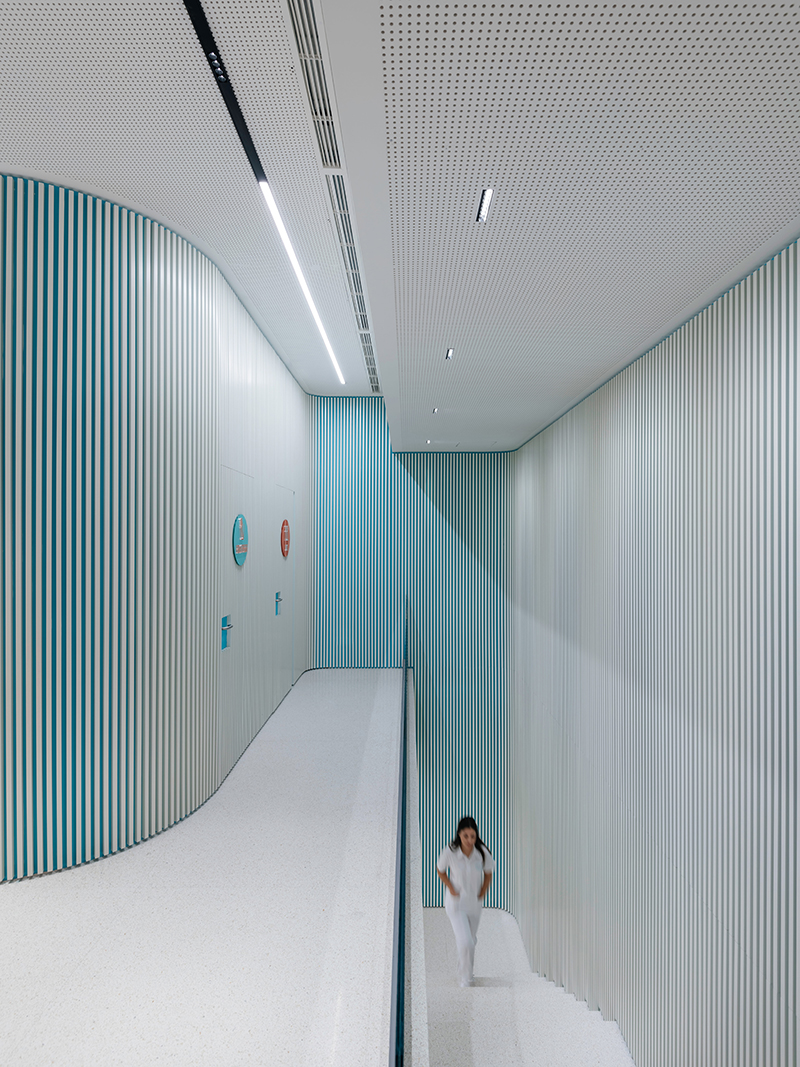
The Twist project enabled us to draw on our broad knowledge and experience of designing healthcare spaces around the world, playing around with concepts and ideas and ultimately approach the design process from a different angle.
A key reason we have been able to develop a strong niche in this sector is due to the deep understanding of technical workspaces we have developed over many years.
There are many factors which must be carefully considered in live clinic environments, including careful management of space and the free-flowing movement of surgical teams and patients. Practical and ergonomic solutions for technical equipment, instruments and waste disposal are also fundamental and must work seamlessly with any design concept.
